E-commerce Redesign: Service Vouchers & Cards
Consolidated 15 regional e-commerce websites into a single platform supporting 12+ languages, coordinating across 130 people in 5 teams.
Problem Statement
The client sells wellbeing solutions — meal vouchers, gift cards, and benefits products. After acquiring competitors across multiple countries, they needed to consolidate 15 regional websites into a single unified platform.
The platform serves three distinct targets: the company purchasing the service, the merchant accepting it, and the employee using the voucher or card.
Project Goals
- Create a unified user experience and brand across all markets
- Gain +10% market share
- Innovate by mapping user needs, not by assumption
Research Methods
Users had never been interviewed on the previous sites. To change that, we organized batches of user interviews every three weeks throughout the project.
Methods used: stakeholder interviews, user interviews, personas, jobs to be done, user journeys, usability tests, information architecture mapping, mental models, tone of voice definition, card sorting.
"In order to understand their needs, we organized batches of user interviews every 3 weeks. It made us aware of their pains and struggles. We defined user profiles and the corresponding journey. Finally, we tested the flow, the information architecture, legibility, and with the results refined the prototype each time. I conducted around 45 user tests."
Key Focus Areas
- What are the end user, merchant, and company met and unmet needs?
- Which tasks do people need to complete, and in which order?
- Which profiles use smartphone vs desktop, and how?
- What is the best way to upload employee data?
- What steps slow users down, or can be eliminated?
Core Customer Needs
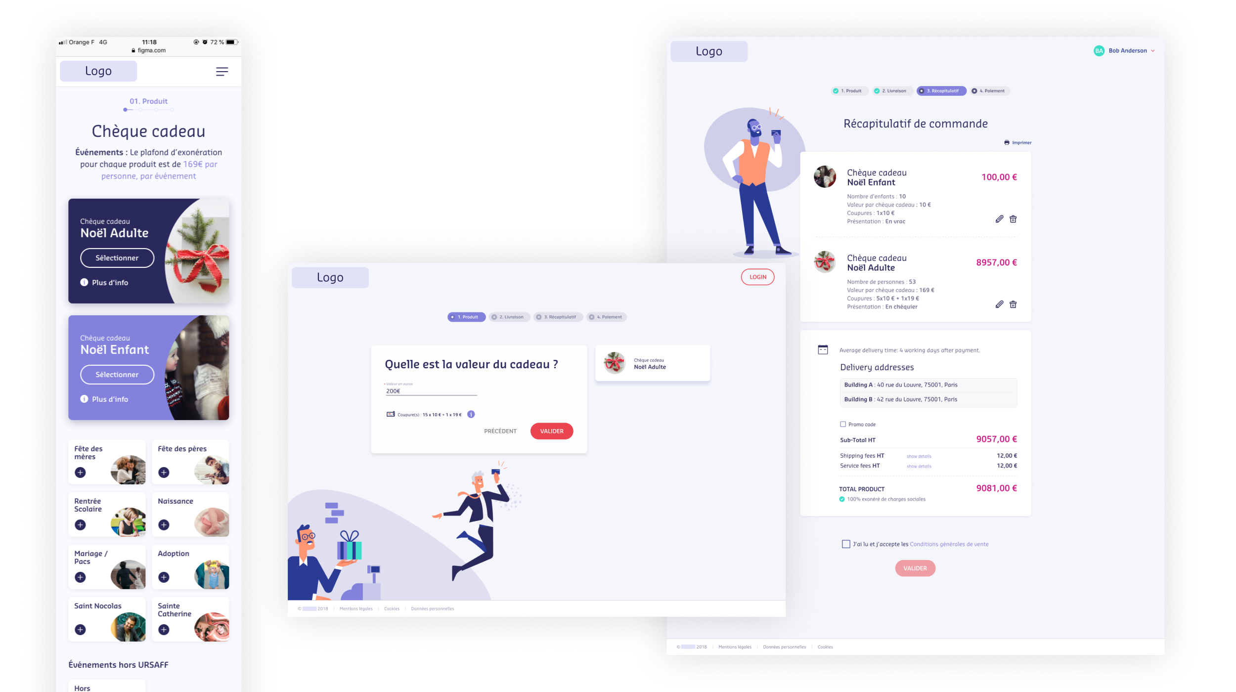
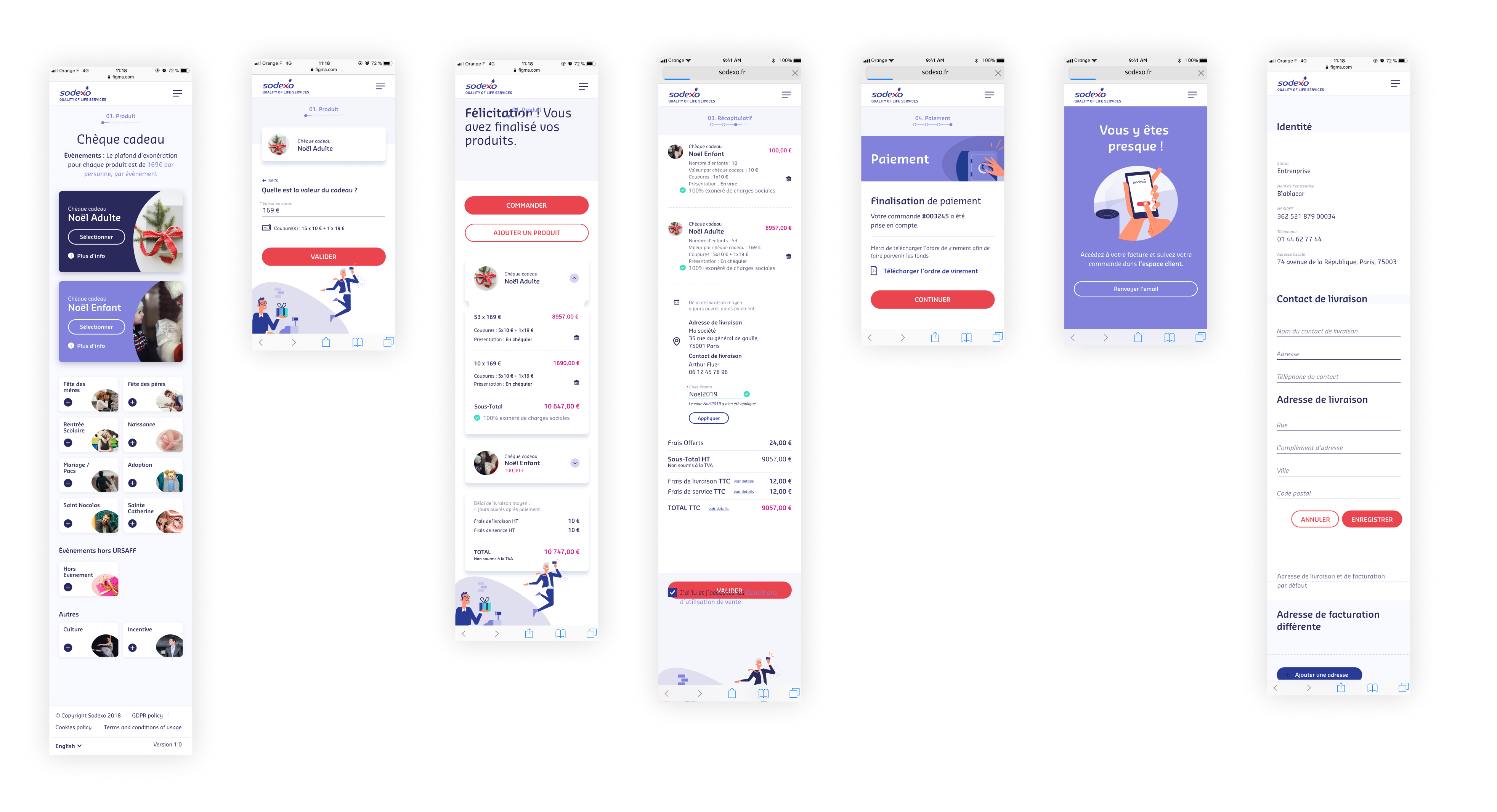
Help choosing the right product and understanding the legislation. Reading dense legal text isn't useful at the point of purchase. Surfacing the key points at the right moment reassures customers spending significant sums.
Getting a quote before entering legal information. Most customers benchmark competitor sites before committing. A fast, low-friction quote flow is critical for staying in consideration.
Mobile-friendly experience. Most voucher purchases happen at a desk, but company directors want to buy on the metro or at home on a tablet. The experience had to work everywhere.
Simple card management for end users. End users have three core needs: find where to use the card, check the balance, and reorder a lost card. Two screens matter most: the store locator and the card management page.
Synthesis
Following our customer interviews, we synthesized our findings and created a customer journey, defined multiple profiles, and presented these to the client. This analysis gave us a strong foundation for feature ideation and prioritization.
Mobile screens
Learnings
- Working in a major project with 6 teams and 150 people over 18 months.
- Stepping into a lead role and mentoring other designers.
- Migrating from Sketch to Figma mid-project without losing velocity.
- Managing a design system across 30+ files and 12 designers.
- Documenting the design system properly using Zeroheight.
- Running recurring user test batches and sharing synthesis across multiple teams.
- Collaborating with the growth team on analytics; designing to measurable outcomes.
Impact
Users gave the new platform an average satisfaction rating of 7.6, close to the client's reference benchmark of 7.8.