Oxford City Guide
Designing a trustworthy, offline-capable city guide for diverse audiences. Modernizing the experience for iOS/Android launch readiness.
Project Overview
Oxford City Guide is a multilingual mobile app (iOS/Android) serving tourists, students, and academics across hundreds of POIs and tours. The inherited UI had monolithic tour flows, inconsistent spacing and terminology, and weak clarity around offline mode and permissions. Map and tour flows relied on implicit behaviors — auto-start, ambiguous exit — audio failed silently, and "offline" was unproven.
The work spanned a refactor stabilization phase and iOS launch readiness, embedded with the PM and engineering team.
Team: Flutter engineers, QA, content, data Tools: Figma, Flutter UI reviews, moderated and unmoderated usability tests, localization and accessibility audits, design system tokens, telemetry pairing
Challenge & Context
Deliver a trustworthy, offline-capable guide while aligning with Apple HIG and privacy expectations. The goal: modernize the experience without breaking existing functionality, and prepare for App Store and Play review with privacy-safe patterns.
Key questions driving the work:
- What convinces users offline actually works (proof flows, download sizing, test snippets)?
- How should tour start and exit feel across entry points (auto vs manual; preload vs immediate)?
- What audio behaviors (speed, fallback, transcripts) keep users engaged despite network drops?
- How do permission prompts and privacy copy affect adoption and denial rates?
- Which UI terms resonate across languages ("places" vs "POIs"), and how to show translation coverage?
User Research & Discovery
Methods: Moderated usability on tour start/exit, offline packs, and audio fallback. Unmoderated tasks for start/exit microflows. Field tests on spotty networks and airplane mode. Accessibility runs (large text, screen reader, outdoor contrast). Localization checks for en/ja/fr permission copy and translation coverage.
Participants: Tourists, students, academics, international families. Bilingual participants for JP/FR. Mixed devices and OS versions.
Key user profiles:
- Tourists needing quick curated loops
- Students on 1-hour breaks
- Academics seeking depth and credibility
- International families needing bilingual and offline reliability
What we found:
"I won't believe offline until I can test it in 30 seconds — show me it works before I travel."
Four pain points shaped the design:
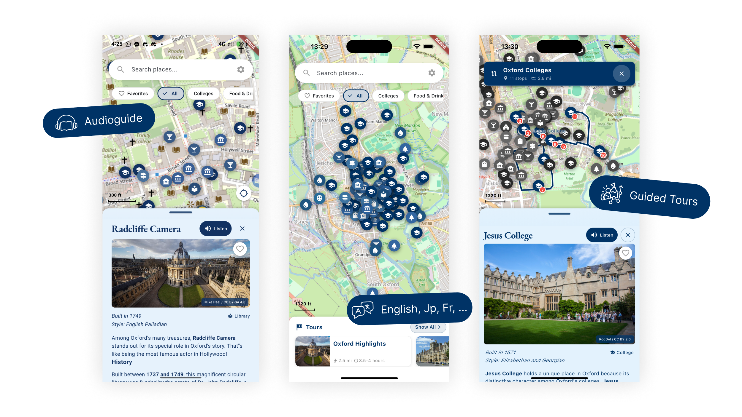
- Unclear tour start/exit → explicit Start with preload indicator, tour-aware centering, manual GPS override; Exit with save-progress and quick feedback; Resume entry point.
- Offline claims doubted → download size/time estimate, offline test card, partial-offline transparency (map/text vs audio/images).
- Audio failures kill trust → visible fallback to device TTS with text highlight/transcript and speed control; surfaced error states.
- Permission fatigue → single well-timed prompt with on-device copy; optional background location only with stated benefit.
Design Process & Approach
Discovery/Definition. Audited navigation, permissions, and offline flows. Mapped pain points to events and metrics. Set success criteria (time-to-start, offline pass rate, audio fallback success). Identified terminology, spacing, and HIG alignment gaps.
Ideation/Design. Prototyped tour start/exit, offline pack UI, permission copy variants, and audio controls with fallback states. Designed translation coverage indicators, accessibility overlays, and map chrome (scale bar, distance units). Built design system tokens and components in Figma aligned to Flutter widgets.
Testing/Iteration. Moderated tests with forced network drops and GPS wobble. Unmoderated start/exit tasks. Localization and accessibility runs. Iterated on copy, fallback visibility, preload indicators, and Exit/Resume flows.
Solution & Key Features
Tour flow clarity. Prominent Start with preload indicator. Tour-aware map centering. Manual GPS override. Exit with save-progress and two-tap feedback. Resume surface in-app and via notification. Skip/reorder stops for advanced users. Completion recap with badge and share.
Offline proof & control. Download cards with size/time estimates. Offline test card. Pack status and partial-offline transparency. Last-updated timestamp to build trust.
Audio & accessibility. Engine selection (studio/device TTS). Speed control. Transcript with highlight-as-you-listen. Visible fallback path with user-friendly errors. Language toggle and translation coverage indicator. Larger tap targets, contrast tokens, dynamic-type-friendly layouts.
Design System
Tokens for spacing, typography, and colors. Component variants for buttons, cards, and dialogs. Map chrome included. Permission banners and status toasts. Usage guidelines for language switches, accessibility (dynamic type, contrast, tap targets), permission copy variants, and offline status states.
Impact
- Reduced tour start friction in tests: faster time-to-start, higher start rate on first attempt.
- Higher stated trust in offline after proof flow. Fewer permission denials in testing.
- Audio completion improved with visible fallback and transcripts.
- Accessibility compliance improved: dynamic type respected, better contrast and tap targets.
- Design system alignment reduced rework during engineering refactors.
My Role
I led UX research and synthesis, defined personas and journeys, and crafted permission, offline, and audio flows. I built design system tokens and key components, ran accessibility and localization audits, and partnered with engineering on feasibility for offline, audio fallback, and tour UX changes.