Marne Aval Supervision
Designing a real-time industrial "Tableau de Bord" (Dashboard) to help wastewater plant operators transition from managing 1,600 raw alarms daily to monitoring predictive availability indicators.
Project Overview
The Marne Aval (MAV) plant processes 75,000 m³ of wastewater daily for 16 communes. The project, commissioned by SIAAP (Service public de l’assainissement francilien), aimed to harmonize industrial tools by creating a digital dashboard that visualizes the real-time availability of equipment. The project involved a collaboration between the design agency Attoma, the engineering firm ERAS, and software specialist UReason.
Challenge & Context
The plant's operators were facing a severe "information saturation" issue. The system generated approximately 1,600 alarms per day, with 350 to 400 active permanently. This volume led to a desensitization effect where operators would filter out Level 2 alarms, potentially missing critical issues. The challenge was to move from a reactive model based on a raw list of faults to a proactive model based on functional availability indicators.
Project Goals
- Reduce Alarm Saturation: Implement filtering and prioritization rules to present only actionable information, reducing the cognitive load on operators.
- Decision Support: Create specific indicators for different trades (maintenance, process) to improve the anticipation of equipment failure and facilitate the "handover" between shifts.
- Harmonization: Define a standard for managing alarms and visual interfaces that could be deployed across different sites (Marne Aval and Seine Grésillons).
User Research & Discovery
To understand the complex industrial context, we employed an immersive methodology:
- On-site Observations: We conducted observations of the "File Eau" (Water line) and "File Boue" (Sludge line) processes to map usage journeys and identify pain points in the current multi-channel environment (screens, tablets, wall charts).
- User Profiles: We identified key personas including the Shift Team Leader (monitoring and piloting), Maintenance Service, and the "Cellule BPE" (Process Study Unit).
- Key Insight: Operators needed to know the availability of a function (e.g., "Is the Dehydration zone operational?") rather than the technical status of a single sensor. The raw list of 1,600 alarms obscured the actual health of the plant.
Design Process & Approach
The project followed a rigorous co-conception process over 10 months:
- Discovery & Rules (Offline): We worked with the engineering team (ERAS) to define the functional calculation rules. For example, defining that a "Pre-treatment" zone is "Available" even if 1 out of 4 pumps is down, provided the flow rate is met.
- Co-conception Workshops: We facilitated 5 major workshops with SIAAP operators and stakeholders. These sessions were used to validate the hierarchy of information, define navigation paths, and test clickable prototypes.
- Iterative Prototyping: We used InVision to create dynamic prototypes, allowing operators to test scenarios like "Threshold Crossing Alerts" or "Bypass Alerts" before the final development.
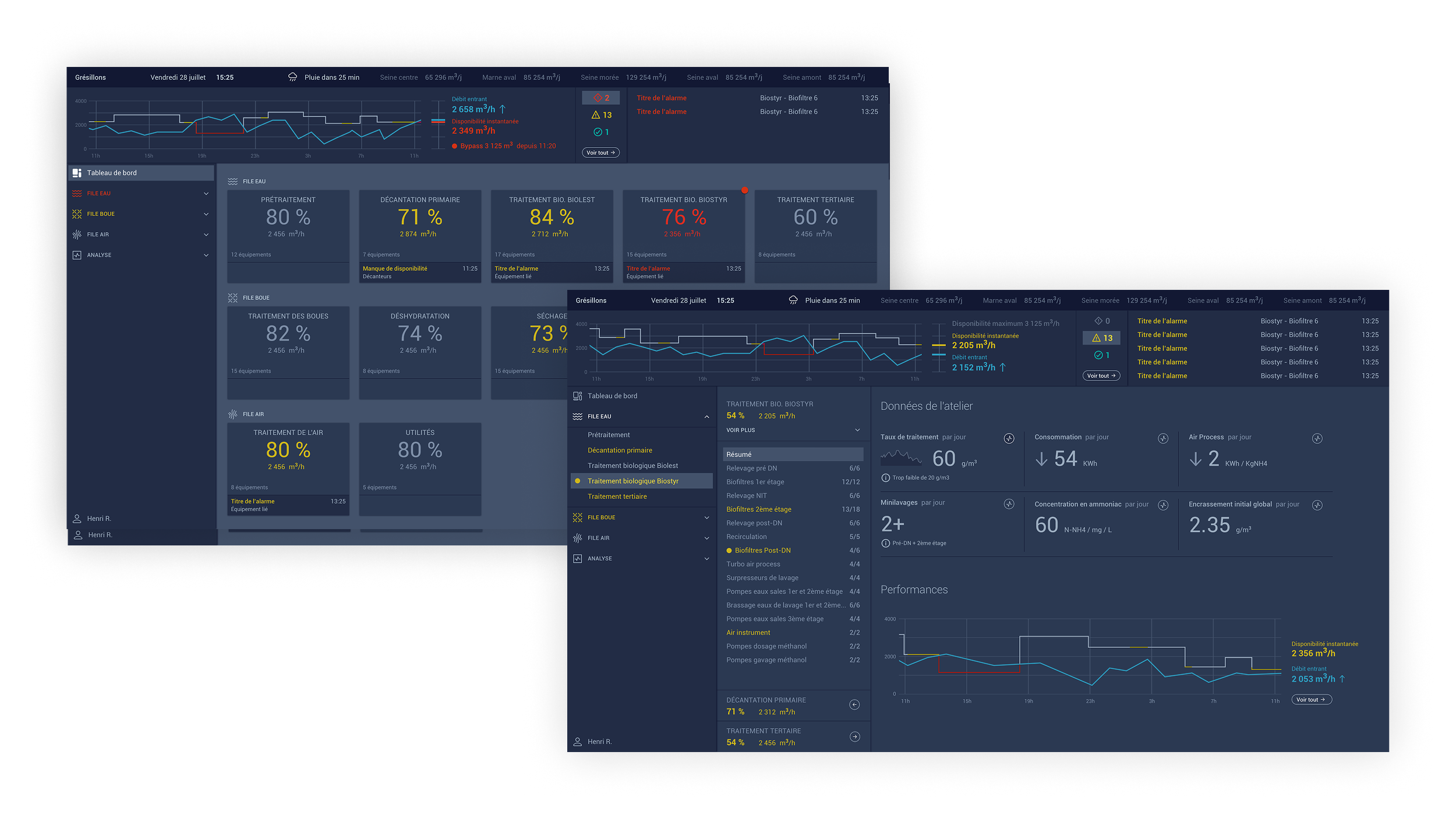
Solution & Key Features
The final solution was a touch-optimized "Tableau de Bord" (Dashboard) integrated with Wonderware InTouch and OASYS-AM systems.
- Availability Indicators: Instead of listing faults, we designed a visual system using Green (RAS/Level 0), Orange (Alert/Level 2), and Red (Critical/Level 3) to indicate the computed availability of equipment.
- Plant Navigation: The interface uses horizontal tabs for quick access to specific plant sections (e.g., Pre-treatment, Biological Treatment, Incineration), allowing operators to instantly assess the availability rates of functional groups.
- Common Trade Screen: We designed a specific "Common Trade Screen" intended to be readable from 3 meters away. It aggregates real-time data from different trades to facilitate cross-team coordination.
Visual Design
The UI was designed for high legibility in an industrial control room environment:
- Color Logic: A strict color code was applied where Grey indicated "RAS" (Nothing to Report) for Ateliers, while Green indicated "RAS" for specific equipment, ensuring that colored elements (Orange/Red) immediately drew attention to anomalies.
- Readability Standards: For the large "Common Trade Screen," we established specifications requiring a minimum font size of 30px and sans-serif fonts (Arial/Verdana) to ensure readability from a distance of 3 meters.
My Contribution & Role
As part of the Attoma design team, my responsibilities included:
- Observation & Analysis: Modeling user journeys and analyzing the existing information architecture.
- Co-conception: Participating in the animation of workshops to define functional rules and interface needs with the client.
- UI/UX Design: Designing the interface screens, defining the visual language (icons, typography, contrasts), and creating the interactive InVision prototypes for validation.