Oxford City Guide
Designing a trustworthy, offline-capable city guide for diverse audiences.
Project Overview
Client: Oxford City Guide (tourism + education partners)
Role: Lead Product Designer (end-to-end UX/UI, research, prototyping, design system, handoff)
Duration: Multi-phase 2024–2025 (refactor stabilization → iOS launch readiness)
Team: Cross-functional squad (Flutter engineers, QA, content, data); designer embedded with PM/engineering
Tools & Methods: Figma, Flutter UI reviews, moderated/unmoderated tests, localization/accessibility audits, design system tokens, telemetry pairing
Project Scale: Multilingual mobile app (iOS/Android) serving tourists, students, academics; hundreds of POIs/tours; offline-first
Challenge & Context
Deliver a trustworthy, offline-capable city guide for diverse audiences while aligning with Apple HIG and privacy expectations. The inherited UI had monolithic flows (tour start/exit), inconsistent spacing/terminology, and weak offline/permission clarity. Map/tour flows relied on implicit behaviors (auto-start, ambiguous exit), audio failed silently, and “offline” was unproven. We needed to modernize the experience without breaking existing functionality and prepare for App Store/Play review with privacy-safe patterns.
Project Goals
- Make tour discovery/start/exit obvious and fast (target: cut time-to-first-tour by 30% in testing).
- Build trust in offline mode and privacy (target: increase “offline confidence” self-report; reduce permission denies).
- Improve audio/TTS usability (quality, fallbacks, transcripts/highlight; target: reduce audio error dead-ends to near-zero).
- Ensure localization/accessibility readiness (en/ja/fr, dynamic type, contrast, tap targets; target: pass accessibility runs without blocking issues).
- Provide design system consistency to ship faster and reduce regressions (tokens/components mapped to Flutter).
Key Focus Areas / Research Questions
- What convinces users offline actually works (proof flows, download sizing, test snippets)?
- How should tour start/exit feel across entry points (auto vs manual; preload vs immediate)?
- What audio behaviors (speed, fallback, transcripts) keep users engaged despite network drops?
- How do permission prompts and privacy copy affect adoption and denial rates?
- Which UI terms resonate (e.g., “places” vs “POIs”) across languages; how to show translation coverage?
User Research & Discovery
Research Methods: Moderated usability (tour start/exit, offline packs, audio fallback), unmoderated tasks (start/exit microflows), field tests on spotty networks/airplane mode, accessibility runs (large text, screen reader, outdoor contrast), localization checks (en/ja/fr permission copy, translation coverage).
Participants: Tourists, students, academics/locals; bilingual participants for JP/FR; mixed device/OS.
Key User Profiles
- Tourists: Needing quick curated loops.
- Students: On 1-hour breaks.
- Academics: Seeking depth/credibility.
- International families: Needing bilingual/offline reliability.
User Insights & Synthesis
Patterns: offline mistrust without proof; desire for fast, manual tour start with clear preload; need for audio quality + graceful fallback; preference for plain-language permissions; terminology simplicity; translation coverage transparency.
"I won’t believe offline until I can test it in 30 seconds—show me it works before I travel."
- Pain Point 1: Unclear tour start/exit → explicit Start, preload indicator, tour-aware centering; Exit with save-progress + quick feedback; Resume entry point.
- Pain Point 2: Offline claims doubted → download size/time + offline test card; partial-offline transparency (map/text vs audio/images).
- Pain Point 3: Audio failures kill trust → visible fallback to device TTS with text highlight/transcript and speed control; error states surfaced.
- Pain Point 4: Permission fatigue → single well-timed prompt with on-device copy; optional background with stated benefit only.
Core Customer Needs
- Reliable guidance offline: Downloadable packs with proof and recaps; no surprise network dependency; size/time transparency.
- Clarity and control: Clear Start/Exit, resume, manual override when GPS wobbles; skip/reorder stops.
- Accessible, localized storytelling: Dynamic text, high contrast, multilingual content/audio; translation coverage indicator; transcripts.
Design Process & Approach
- Discovery/Definition:
- Audited navigation, permissions, offline flows; mapped pain points to events/metrics.
- Defined personas/journeys; set success criteria (time-to-start, offline pass rate, audio fallback success).
- Identified terminology, spacing, and HIG alignment gaps; cataloged accessibility risks.
- Ideation/Design:
- Prototyped tour start/exit, offline pack UI, permission copy variants, audio controls/fallback states.
- Designed translation coverage indicators, accessibility overlays (step-free hints), map chrome (scale bar, distance units).
- Built design system tokens/components in Figma aligned to Flutter widgets.
- Testing/Iteration:
- Moderated tests with forced network drops and GPS wobble; unmoderated tasks for Start/Exit; localization/accessibility runs.
- Iterated copy, fallback visibility, preload indicators, and Exit/Resume flows; simplified jargon.
Solution & Key Features
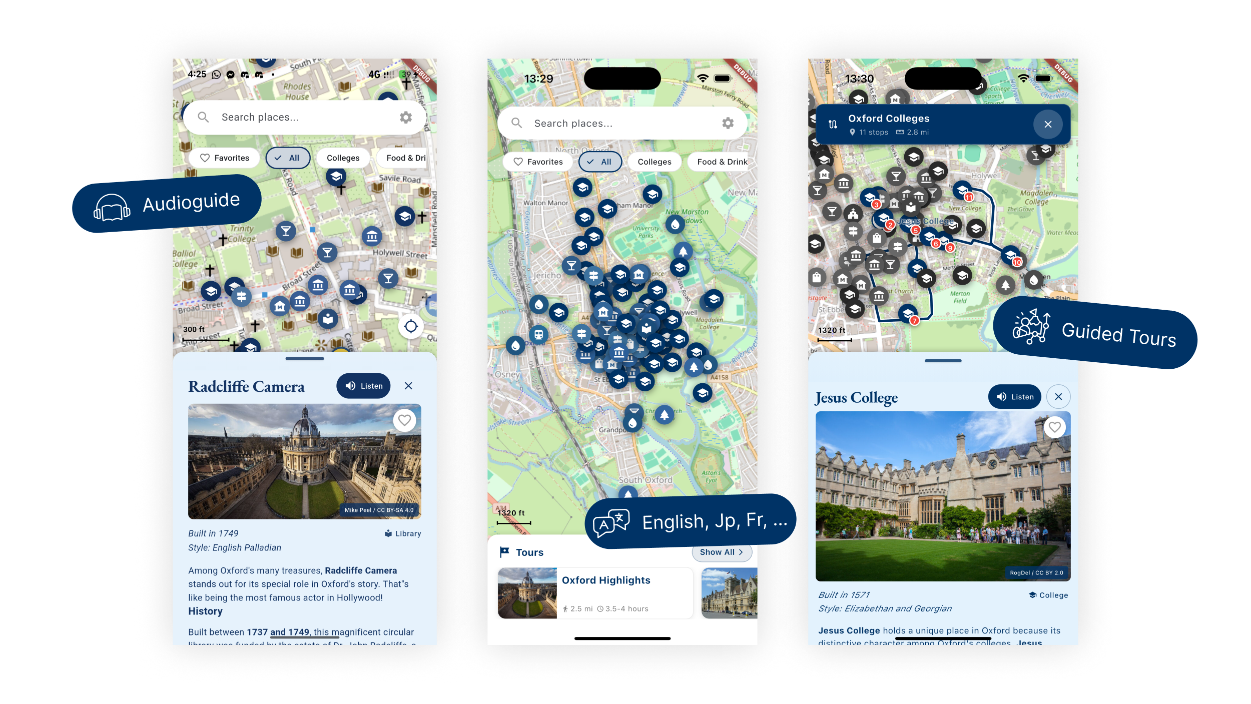
Tour Flow Clarity
- Prominent Start with preload indicator; tour-aware centering; manual override when GPS wobbles.
- Exit with save-progress + 2-tap feedback; Resume surface in app and via notification.
- Reorder/skip stops for advanced users; recap at completion (stops visited, badge/share).
Offline Proof & Control
- Download cards with size/time estimates; offline test card; pack status and partial-offline transparency (map/text vs audio/images).
- Pack chooser for “essentials” vs full (planned); last-updated timestamp to build trust.
Audio & Accessibility
- Engine selection (studio/device); speed control; transcripts/highlight-as-you-listen.
- Fallback path visible (studio -> device TTS) with user-friendly errors; language toggle and translation coverage indicator.
- Larger tap targets, contrast tokens, dynamic type-friendly layouts.
Visual Design
- Design System: Tokens for spacing/typography/colors; component variants for buttons/cards/dialogs; map chrome (scale bar, distance units) aligned; permission banners and status toasts included.
- Key UI Components: Tour cards with ETA/stop count and translation coverage; Start/Exit modals; offline pack cards with size/time/offline test; audio controls with fallback state; permission explainer banners.
- Visual Decisions: High contrast for outdoor use; concise, plain-language copy; minimized jargon (“places” not “POIs”); consistent spacing; clear loading/preload affordances.
Design System & Documentation
- Tools: Figma library with tokens; component specs mapped to Flutter widgets; asset usage guidelines.
- Organization: Primitives (color/spacing/typography) → controls (buttons/forms/cards/dialogs) → feature flows (tour start, offline, permissions, audio).
- Docs: Usage guidelines for language switches, accessibility (dynamic type/contrast/tap targets), permission copy variants, offline status states.
Challenges & Solutions
- Offline trust gap: Added download sizing + offline test/status; partial-offline messaging; timestamped content freshness.
- Permission friction: Plain-language on-device copy; single well-timed prompt; background opt-in only with stated benefit; no repeated nagging.
- Audio reliability: Visible fallback path (studio -> device TTS + highlight/transcript); error messaging; speed controls.
- Localization clarity: Translation coverage indicator; terminology swap to “places”; bilingual permission/alert copy checked in JP/FR.
Impact & Results
- Reduced tour start friction in tests (faster time-to-start; higher start rate on first attempt).
- Higher stated trust in offline after proof flow; fewer permission denials in testing; clearer exit/resume path reduced abandonment.
- Audio completion improved with visible fallback + transcripts; accessibility compliance improved (dynamic type respected; better contrast/tap targets).
- Design system alignment reduced rework during engineering refactors (tokens/components reuse).
Learnings & Reflections
- What worked: Forced-failure scenarios (offline/audio/GPS wobble) during testing surfaced real-world gaps early; plain-language copy moved the needle on permissions.
- PM/Eng alignment: Design tokens + facades reduced churn when refactors landed; pairing telemetry schema with UX goals clarified success metrics.
- Future improvements: Ship day planner, indoor/entrance hints, crowd/peak-time hints; expand multilingual QA; add production telemetry dashboards and A/B permission copy tests.
- Personal growth: Strengthened field testing, accessibility reviews, and privacy-forward UX writing; deeper collaboration with engineering on feasibility for offline/audio flows.
My Contribution & Role
- Led UX research and synthesis; defined personas/journeys; crafted permission/offline/audio flows.
- Built design system tokens and key components; ran accessibility/localization audits.
- Partnered with engineering on feasibility for offline, audio fallback, and tour UX changes; provided specs/handoff.
Skills Demonstrated
- Product design (mobile, multilingual, accessibility)
- UX research & synthesis (moderated/unmoderated, failure-path testing)
- Design systems (tokens, components, documentation)
- UX writing (privacy/offline/permission copy)