Designing an e-commerce website for a voucher company
We designed a voucher website regrouping 10+
Problem statement
The client is selling wellbeing solutions such as meal and gift vouchers. They recently acquired competitors in multiples countries. They asked our help to unify all those websites.
The website is aiming for 3 targets: the company paying for the service, the merchant and the employee using the vouchers.
Project goals
- Create a unified user experience and brand
- Gain +10% market share
- Innovate by listening to user feedback, by mapping all their needs
Research methods
- Stakeholders interview
- User interviews
- Personas
- Jobs to be done
- User journey
- User tests
- Information architecture
- Mental model
- Tone of voice
- Card sorting
"On the previous websites, users were never interviewed. In order to understand their needs, we organized batches of user interviews every 3 weeks. it made us aware of their pains and struggles. We defined users profiles and the corresponding journey. Finally, we tested the flow, the information architecture, lisibility, and with the results refined the prototype each time. I conduced around 45 user tests."
Key focus areas
- What are the end user, merchant or company met and unmet needs?
- Which tasks people need to go through? In which order?
- Which profile do they use on their smartphone or their computer? how do they use it?
- What is the best way to upload employee~~s~~ data?
- What can slow a user's process ? Are there steps and/or features that people don't need
Core customer needs
Help with choosing the right product and understand the legislation
Reading a long text about legislation isn't very exciting. Explaining the main points at the right time is helpful. It reassures customers when they need to spend a big amount of money.
Get a quote before typing any legal information
Most of the customers like to benchmark multiple websites before choosing the right one at the right price. Being able to access a quote with a few steps is very important when people are looking at competitors.
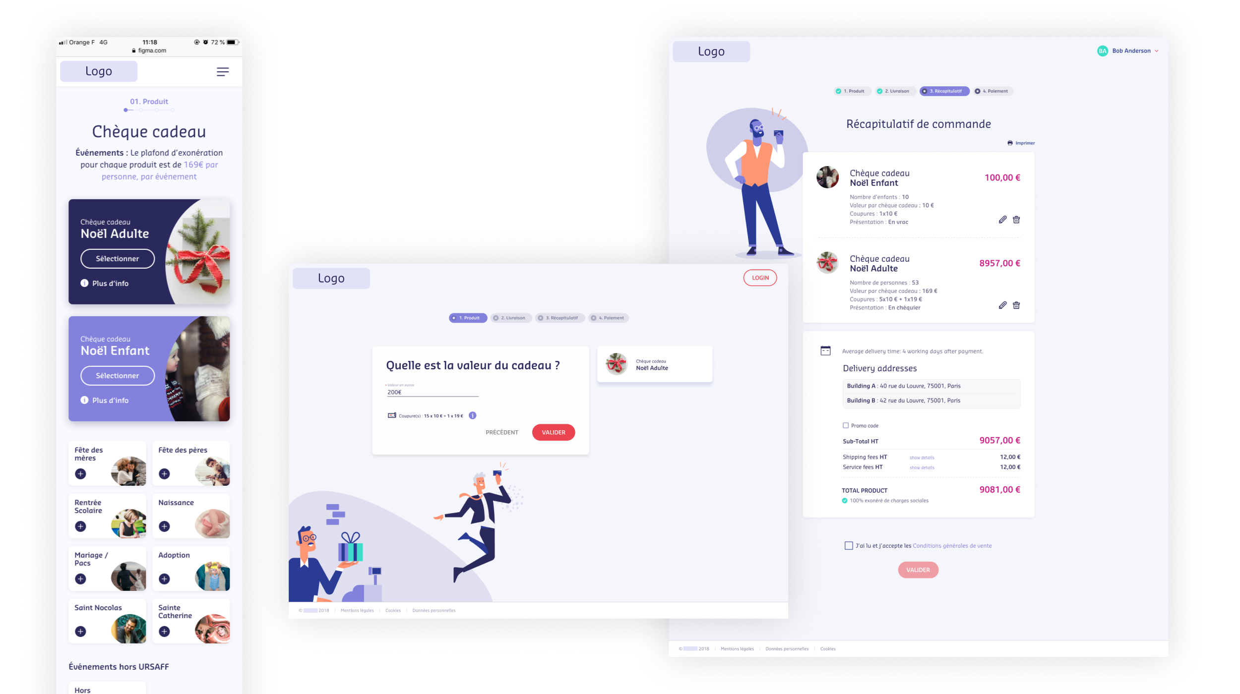
Being mobile friendly
While most of the people will buy vouchers while they are at their desk at work. Most company directors want to buy it on the fly, on the metro on their mobile phone or at home on their tablet.
An easy way to manage the end user's cards.
There are mainly 3 things an end user wants, it's finding where to use his card, how much is there in its balance and how to reorder a card when lost. Only two screens are very important, the store locator and the card management page.
Finding statement
Following our customer interviews, we synthesized our findings and were able to create a customer journey, define multiple profiles which were presented and discussed with the client. This analysis created a great foundation to move into feature ideation and prioritization.
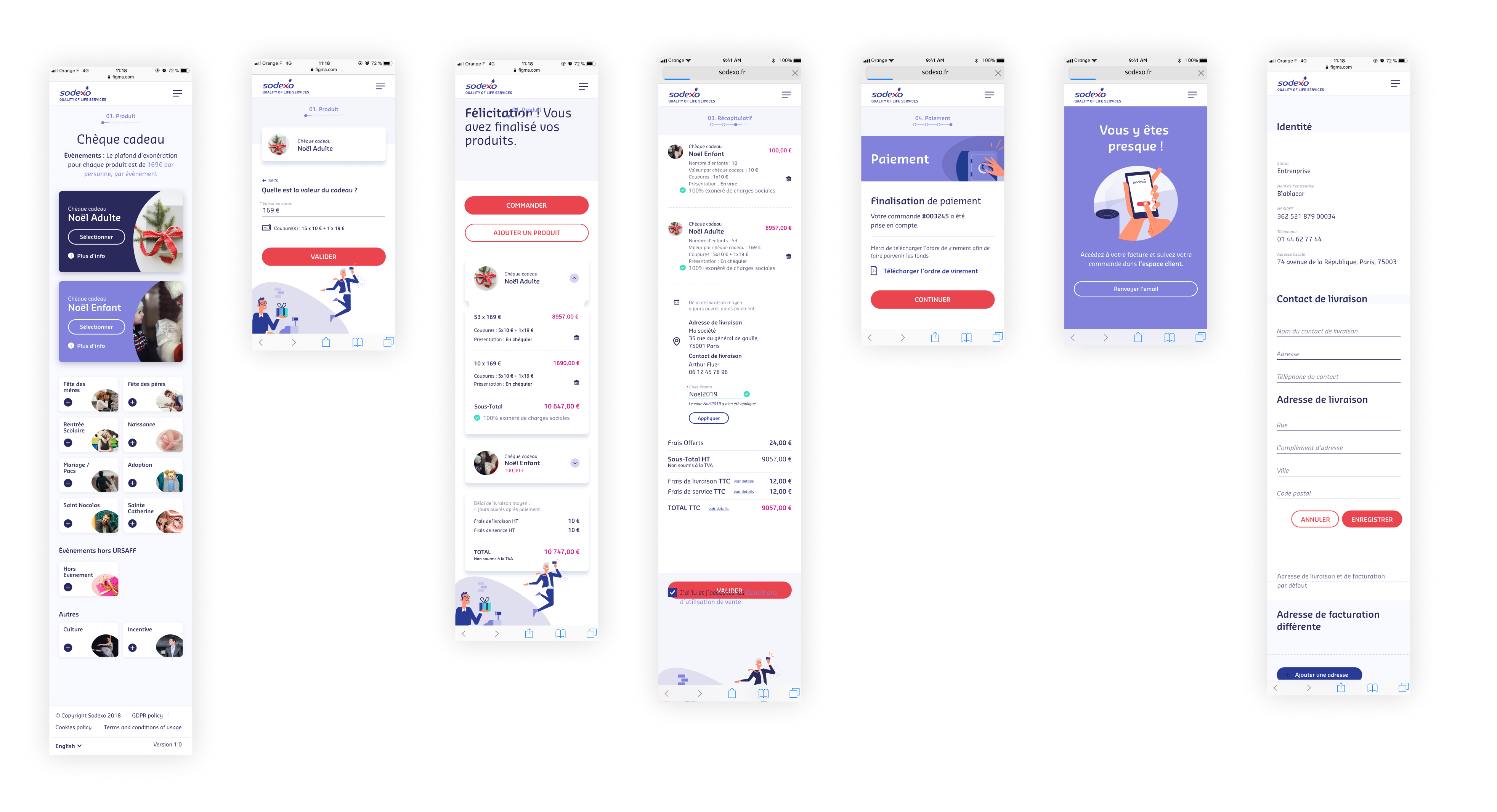
Mobile screens
Learnings
- Work in a huge project with 6 teams, 150 people, during a year and half.
- Being a lead and teach design
- Switch from Sketch to Figma in the middle of the project
- Using a design system with 30+files and 12 designers
- Learned how to document the design system properly with Zeroheight
- Create recurring user tests and sharing the synthesis with multiple teams
- Work with the growth hacker team, which was mainly taking care of the analytics.
How the project affected users and business?
Users are pretty happy with the new solution, and give an average rating close their website of reference (rating average is 7.6, their reference is 7.8)
